Components
Accordion
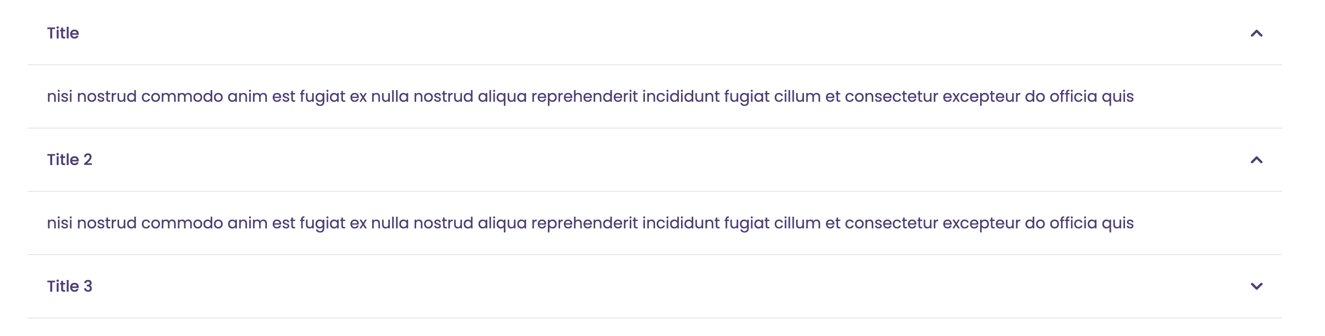
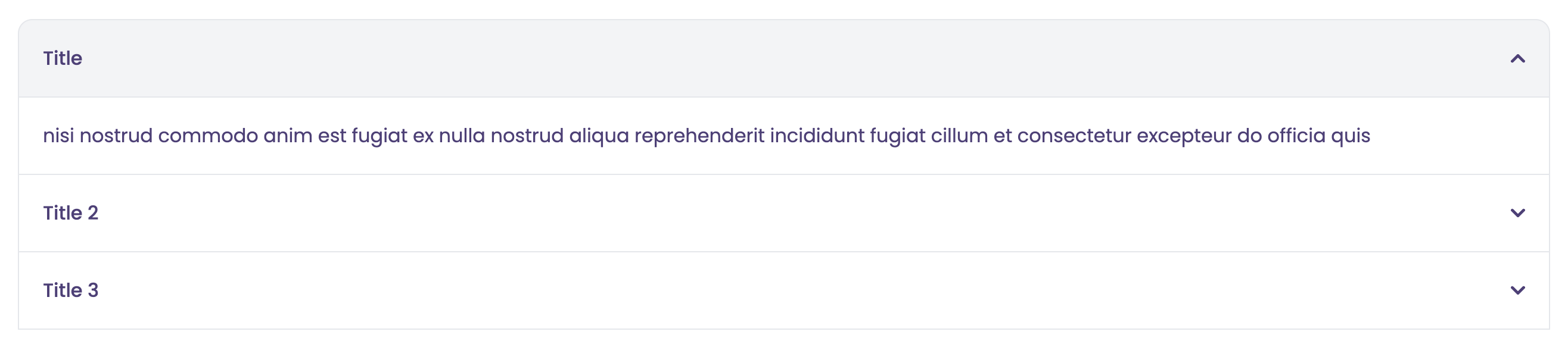
The Accordion component is a container that can be expanded or collapsed to show or hide its content. It is a great way to display a large amount of content in a small space.
Targets
Experience Builder SitesExample
Data Structure
The Accordion component expects an Expression that evaluates to the following data structure:
[
    {
        title: string,
        content: string
    }
]
The content can be any valid HTML content.
Properties
- Auto Collpsed: If true, the accordion will automatically collapse when another accordion is expanded.
- Flush Style: Whether to remove the background color and border from the accordion.